Pressed PR came to us with a DIY logo that no longer reflected where the business was heading.
As a boutique PR agency ready to grow, they needed a brand identity that could command attention and attract the calibre of clients they were built to serve.
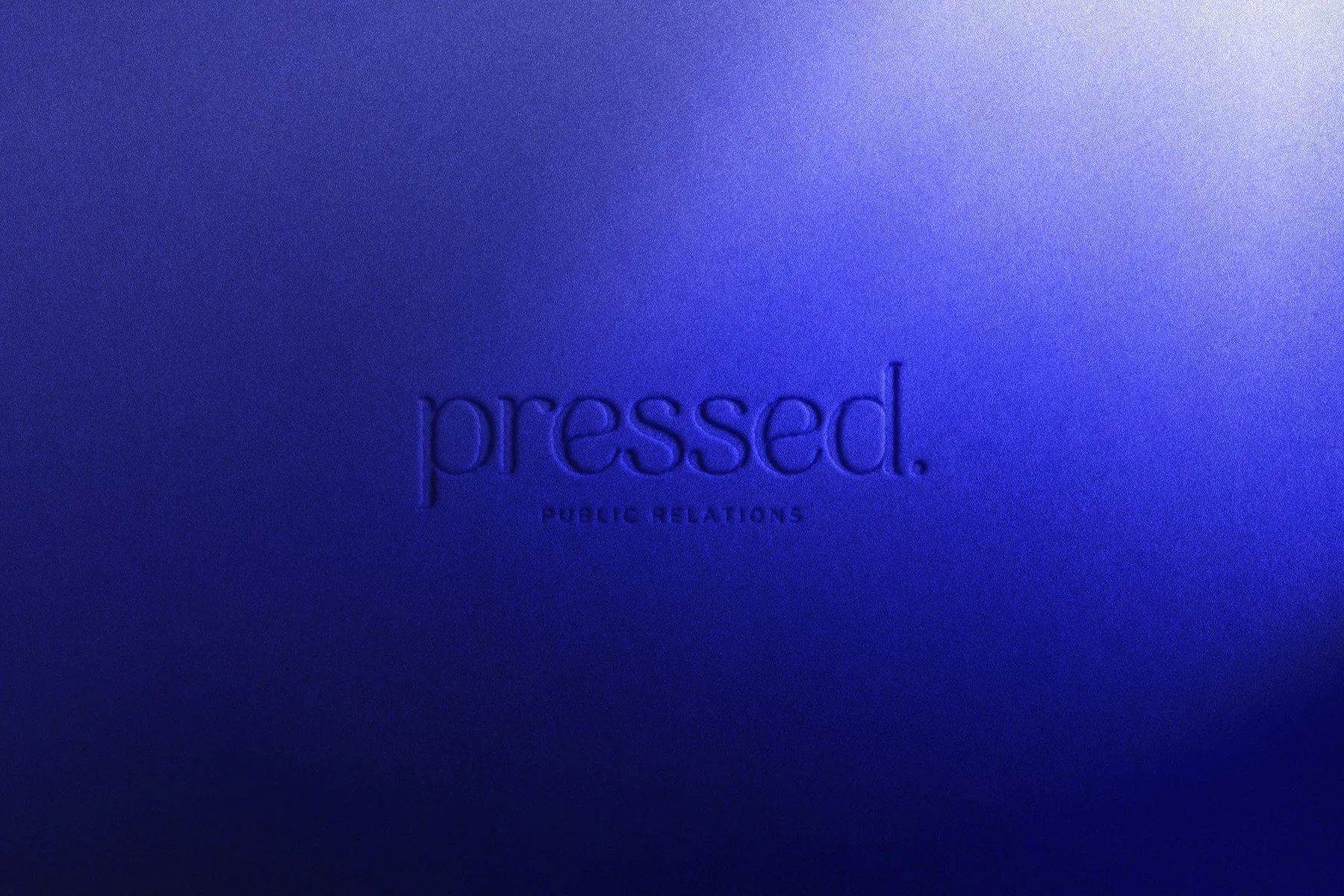
The identity leans into the name, drawing on the craft and character of traditional letterpress printing and reinterpreted as something bold, modern and distinctly Pressed. A bespoke monogram icon completes the system, doubling as a brand seal across print and digital touchpoints.
BRANDING | WEB DESIGN


KIND WORDS“Working with Erin over the past month has been an absolute pleasure. Her creativity, expertise, professionalism, and unique ability to translate our vision-on-a-page into our brand identity is exactly why we will always recommend Erin to any of our clients for design work. Her openness and collaborative approach made the rebranding journey so enjoyable. Whether you are looking for a brand refresh or a new brand identity, Erin will always be our first option!”
Kate Healy – pressed. PR